Concept for changing the logo and overall branding of the restaurant "Open Kitchen", along with the production of materials for promotion. A unique restaurant overlooking the kitchen for guests. We produced a number of photos and video for social media.
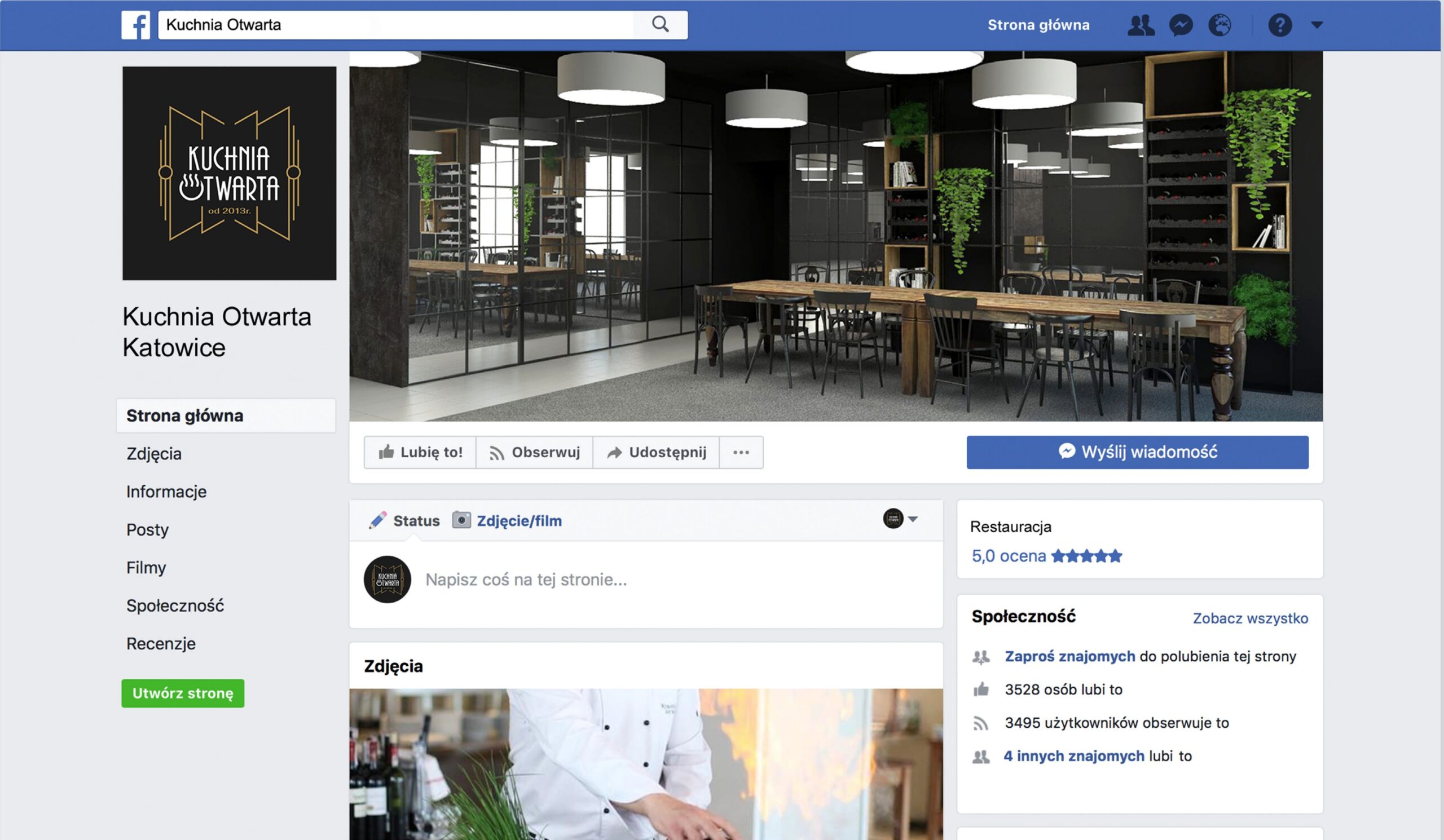
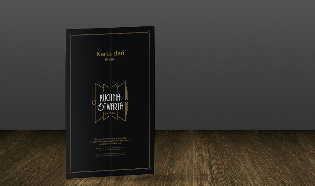
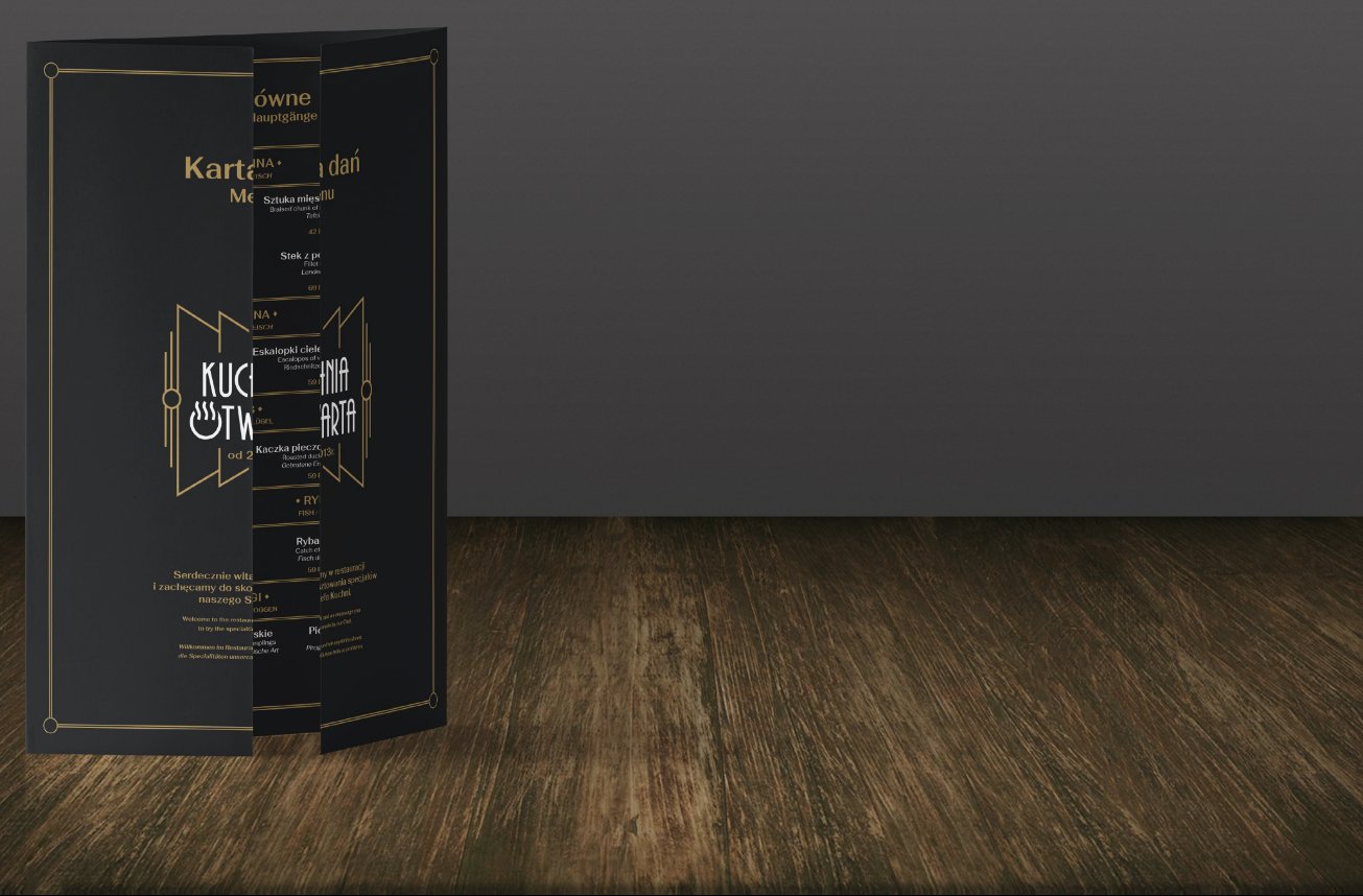
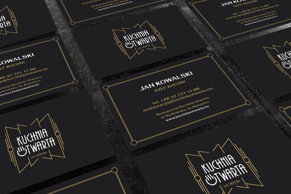
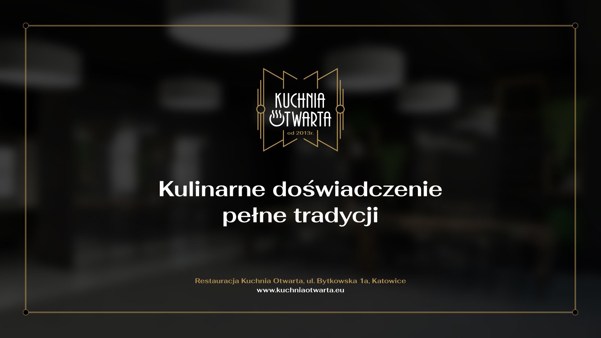
Designing a logo and identification for a restaurant in Katowice
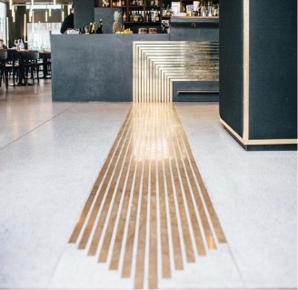
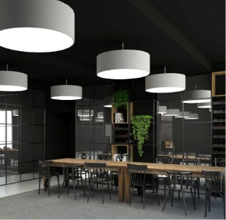
A unique Katowice restaurant with a view of the guest kitchen.
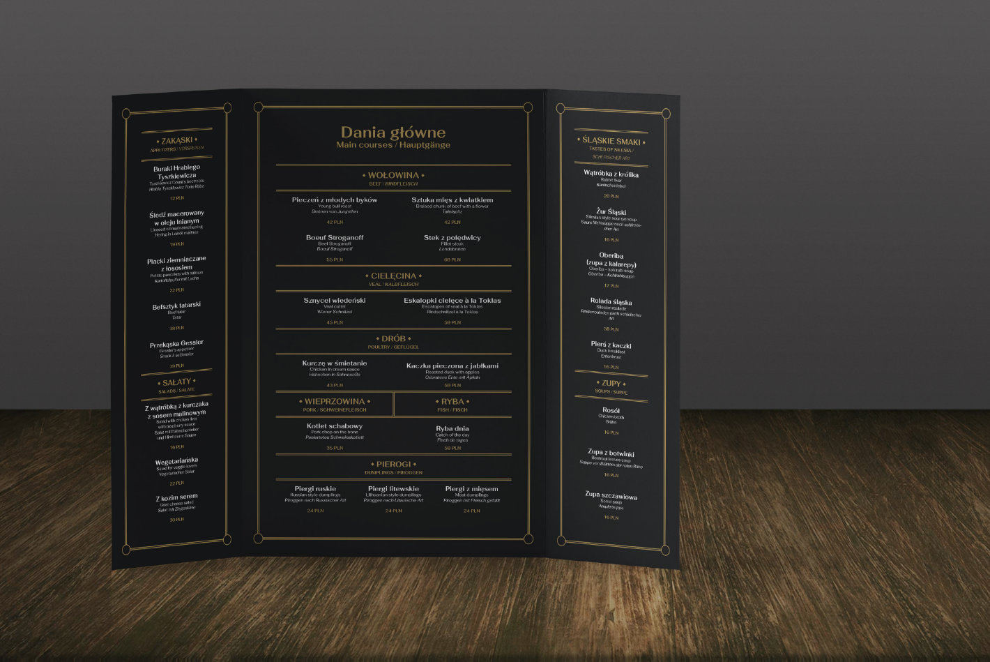
We have developed the concept of a new logo and the basic elements of the restaurant’s image. The aim of these activities was to create a coherent image of the restaurant, combining modernity and tradition, and then presenting these qualities in a visual form. It was important to emphasise the characteristics that distinguish the restaurant from its competition (open kitchen, French service). The materials that we create are to serve the brand of the restaurant and represent it for many years. The concept has not been fully implemented.
The concept has not been implemented.
Target image
Assumptions about brand attributes
Openness
interwar
kitchen
tradition
modern twist
elegance
smell
art deco
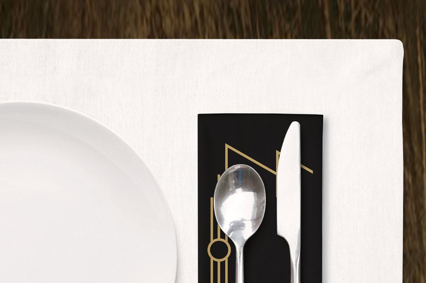
Symbols
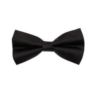
The graphic sign was based on shapes that refer to a wide-open door, which is obviously a direct reference to the openness of the kitchen – the restaurant’s distinguishing feature. The form naturally emphasises the name of the restaurant.ally makes the image coherent.
At the same time it brings to mind the shape of a bow tie that the waiters are to wear, which addition
Stylistics
In accordance with the guidelines, the graphic sign was based on the Art Deco style that reigned in the interwar period. The style is very characteristic, which will enable the recipients to identify a restaurant with interwar cuisine and the symbolism it offers.
Typography
The tailored writing form refers to the Art Deco style aforementioned and perfectly matches the previously described refreshed concept of the restaurant.
An additional graphic element inscribed in the letter “O” enriches the sign with a reference to the plate and the aroma of the dish floating above it, thanks to which the visual message is complete.
Thanks to contrasting the color of the name and the graphic elements, the logo gains legibility.